
Defining new standards of excellence in educational technology that is trusted by millions of educators and students every day
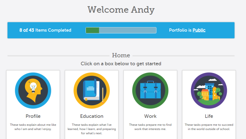
The Maryland Transition Digital Portfolio
We’ve been working for months with the Johns Hopkins University’s Center for Technology in Education (CTE) and the Maryland State Department of Education (MSDE) to create the Maryland Transition Digital Portfolio. The system takes a portfolio-based assessment approach toward preparing special education students for their transition out of special education.
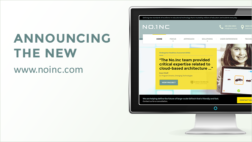
No.Inc Site Relaunch
A lot has changed over the 17 years since we established No.Inc and what better way to showcase our most recent changes but by launching a new website?
Our company has grown. We’ve worked in a lot of industries and done a lot with this medium of the Web. Our focus has always been on creating quality solutions for our clients through creativity, craftsmanship, and collaboration. That focus remains at the core of what we do, but today we are announcing a formal change in the type of work we are doing and for whom we are doing it.